
Policy
A Guide to Converting Signup Pages
Nov
In the world of online marketing and user acquisition, signup pages are the gateway to building a user base, whether for a product, service, or platform. However, merely having a signup page is not enough; it needs to be optimized to convert visitors into users. In this guide, we will explore the strategies, tactics, and best practices for creating signup pages that not only attract attention but also successfully convert visitors into signups.
The Importance of a High-Converting Signup Page
Before we delve into the strategies and techniques for creating high-converting signup pages, it’s essential to understand why these pages are crucial:
User Acquisition: Signup pages are the primary entry point for new users, making them vital for growing your user base.
- Data Collection: They provide an opportunity to gather valuable user data, enabling you to personalize user experiences and marketing efforts.
- Revenue Generation: Signup pages are often the starting point for user subscriptions, purchases, or engagement, directly impacting your bottom line.
- User Engagement: Successful signups lead to higher user engagement, which can translate into customer loyalty and word-of-mouth referrals.
Know Your Audience
Creating a high-converting signup page begins with understanding your target audience:
- User Personas: Develop detailed user personas that encompass demographics, psychographics, pain points, and motivations.
- User Journeys: Map out the user journey to identify touchpoints and opportunities for signups.
- Segmentation: Tailor signup pages to specific audience segments, ensuring relevance and resonance.
Elements of a High-Converting Signup Page
Now, let’s explore the key elements that make up a high-converting signup page:
1. Clear and Compelling Headline
A strong headline is the first thing visitors see, and it should:
- Capture Attention: Use concise, attention-grabbing language.
- Convey Value: Clearly communicate the benefits of signing up.
- Create Curiosity: Evoke curiosity to encourage further exploration.
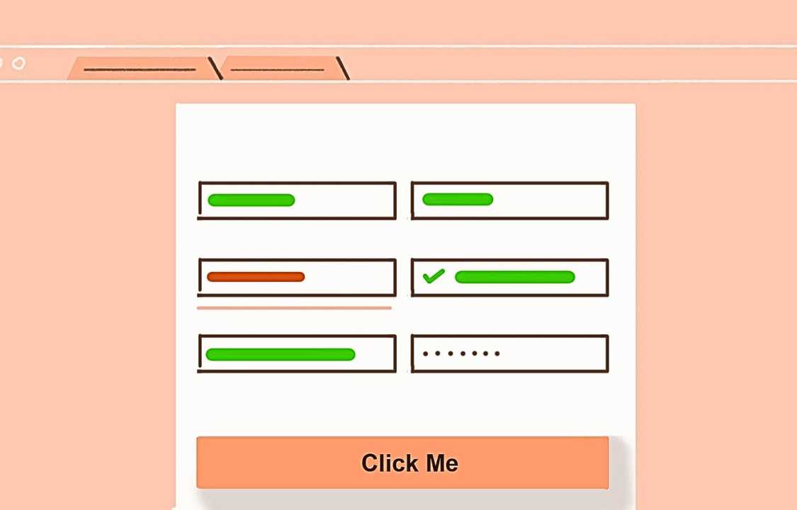
2. Simplified Signup Form
Minimize friction by keeping the signup form simple and user-friendly:
- Minimal Fields: Only ask for essential information. More fields can deter users from signing up.
- Progressive Profiling: Collect additional data over time as users engage with your platform.
- Inline Validation: Provide real-time feedback to prevent form submission errors.
3. Strong Call-to-Action (CTA)
The CTA button should be prominent and action-oriented:
- Clear Language: Use concise, compelling text like “Sign Up,” “Get Started,” or “Join Now.”
- Contrasting Color: Make the CTA button visually stand out on the page.
- Placement: Ensure the CTA is easily accessible and strategically placed.
4. Engaging Visuals
Incorporate images, icons, or videos that reinforce your value proposition:
- Relevance: Use visuals that align with your brand and the signup page’s purpose.
- Authenticity: Showcase real users or scenarios to establish trust.
- Visual Hierarchy: Direct attention toward the CTA button and key messaging.
5. Social Proof and Trust Signals
Build credibility through social proof elements:
- Testimonials: Display genuine user testimonials or reviews.
- Trust Badges: Show security certifications, privacy policies, or industry affiliations.
- Statistics: Highlight the number of users or successful signups.
6. Compelling Benefits
Clearly articulate the benefits of signing up:
- Value Proposition: Explain how users will benefit from your platform or service.
- Use Cases: Provide examples of how users can leverage your offering.
- Features: Highlight key features that address user needs and pain points.
Mobile Optimization
In today’s mobile-centric world, optimizing your signup page for mobile devices is imperative:
- Responsive Design: Ensure your page adapts seamlessly to various screen sizes.
- Mobile-Friendly Forms: Simplify forms and use touch-friendly elements.
- Performance: Optimize page loading times for mobile users.
A/B Testing and Iteration
Creating a high-converting signup page is an iterative process:
- A/B Testing: Experiment with variations of headlines, CTAs, forms, and visuals to identify what works best.
- Data Analysis: Analyze user behavior, conversion rates, and drop-off points to inform optimizations.
- Continuous Improvement: Keep refining your signup page based on user feedback and data insights.
Privacy and Data Security
User trust is paramount. Ensure data privacy and security on your signup page:
- Clear Privacy Policy: Provide a link to your privacy policy, outlining data handling practices.
- SSL Encryption: Implement SSL certificates to secure data transmission.
- Transparency: Communicate how user data will be used and protected.
Conclusion
Creating signup pages that convert is both an art and a science. By understanding your audience, optimizing each element of your signup page, and employing A/B testing and continuous improvement, you can create pages that not only attract visitors but also successfully convert them into users. Remember that user trust, relevance, and simplicity are the cornerstones of a high-converting signup page.